
ParklandCaresFP.com
Freelance: ChuckAlbert.com
Role: Graphic Designer
Freelance: ChuckAlbert.com
Role: Graphic Designer
GOAL
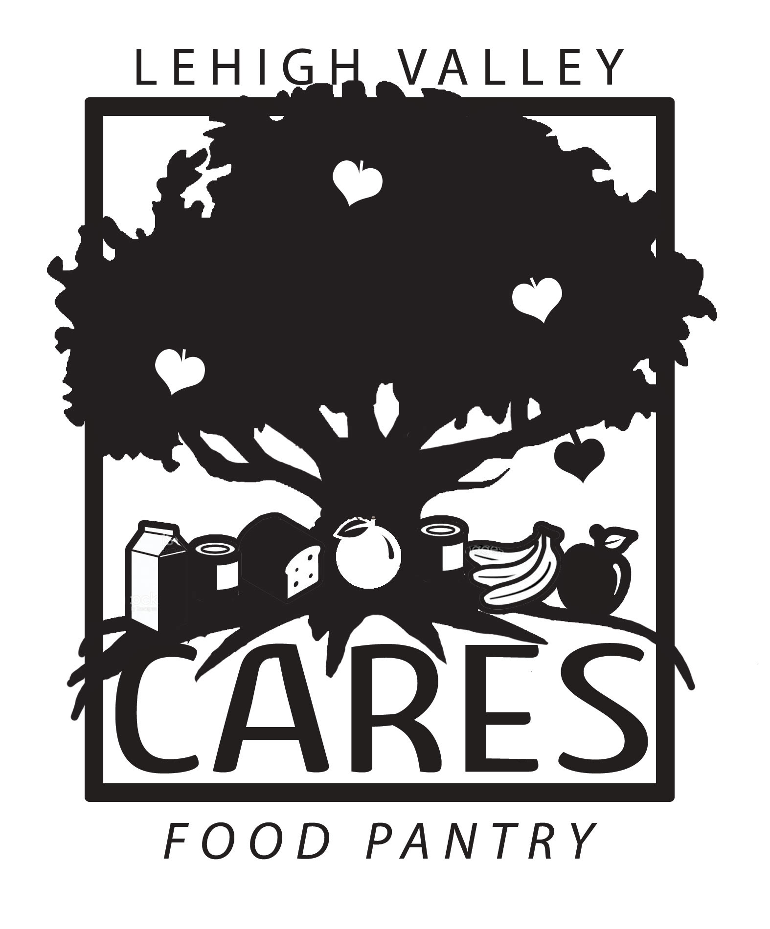
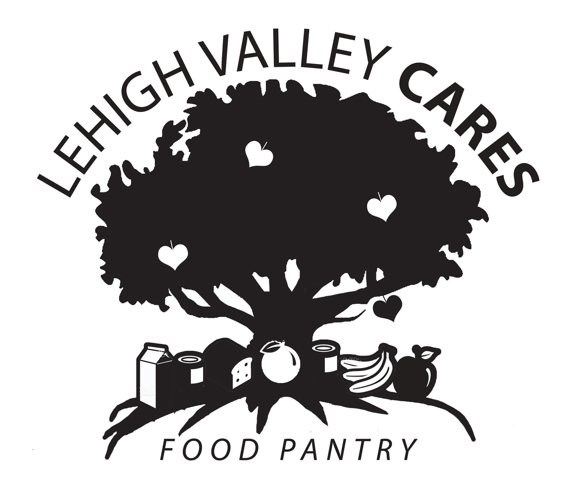
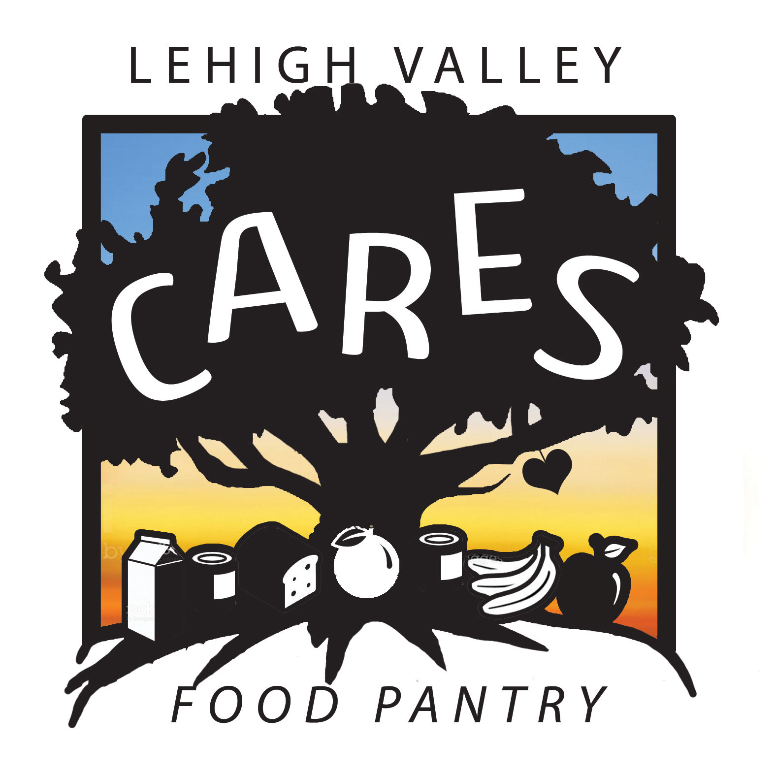
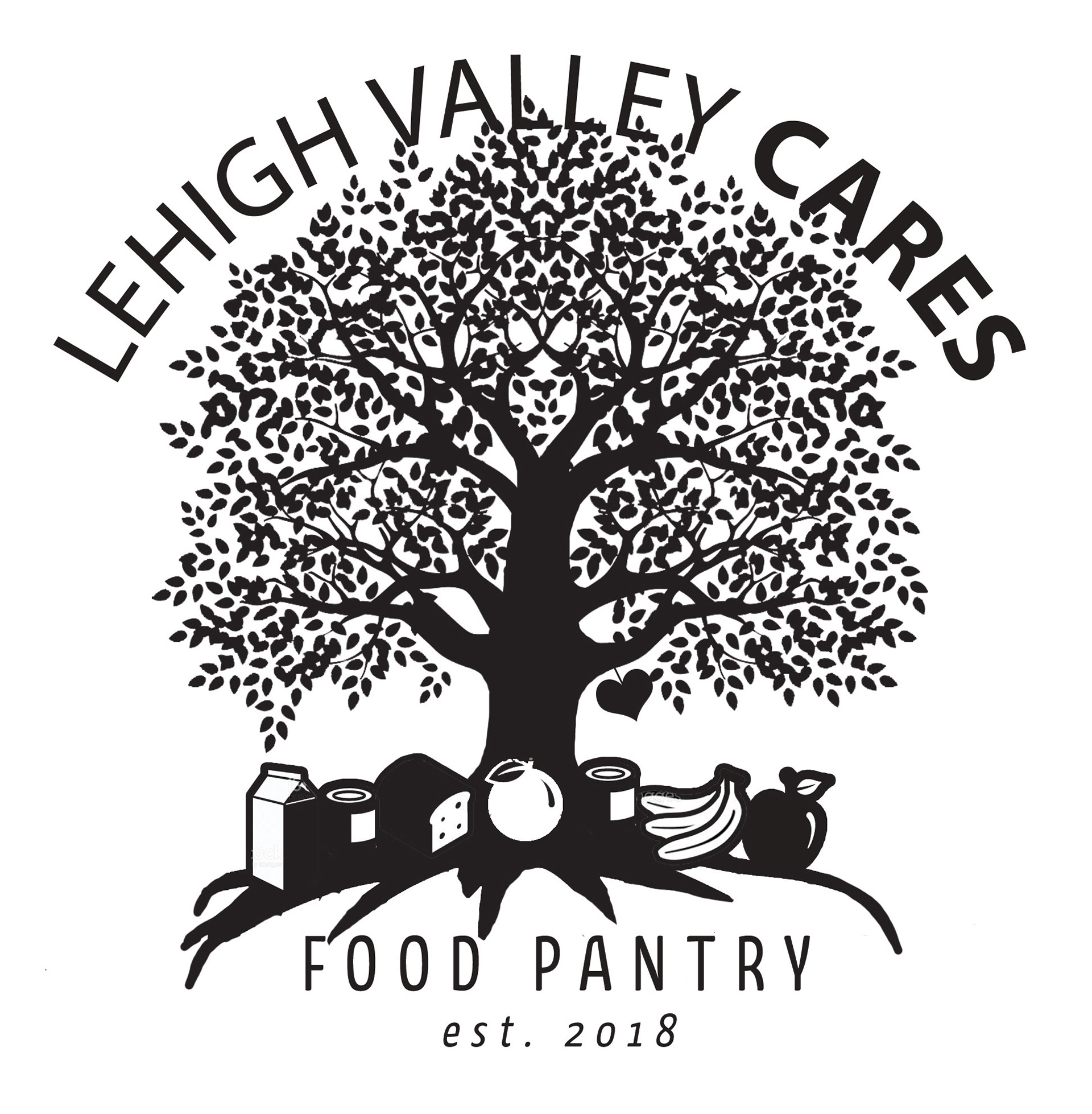
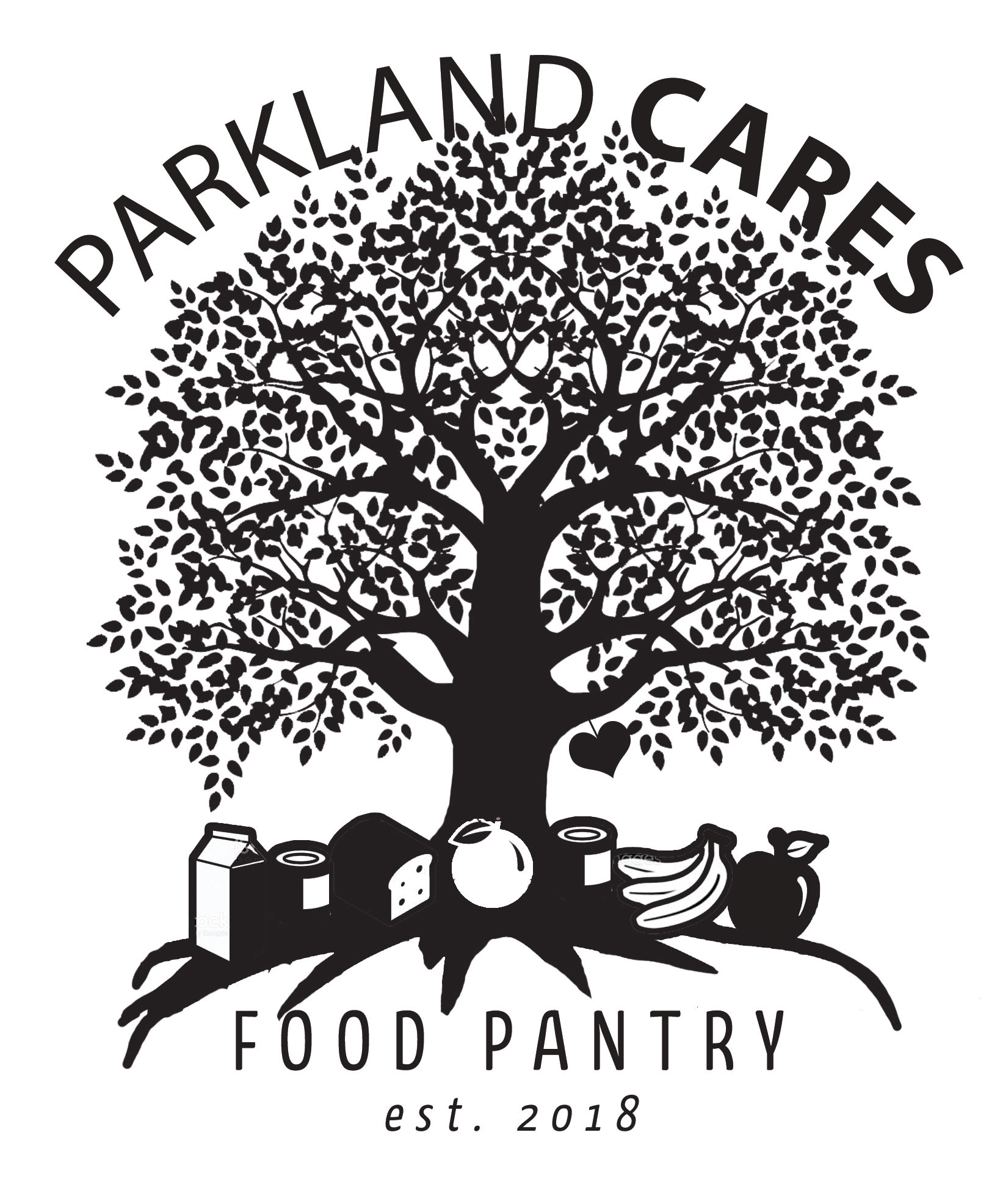
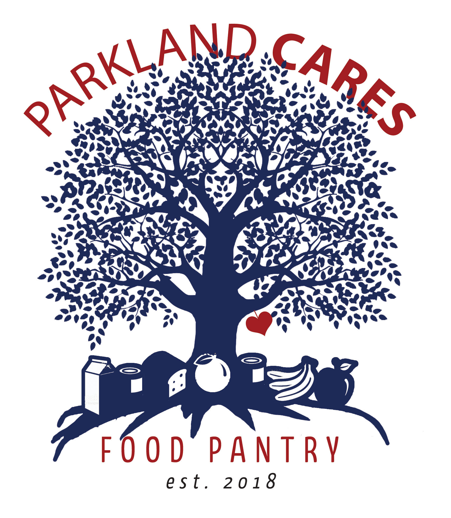
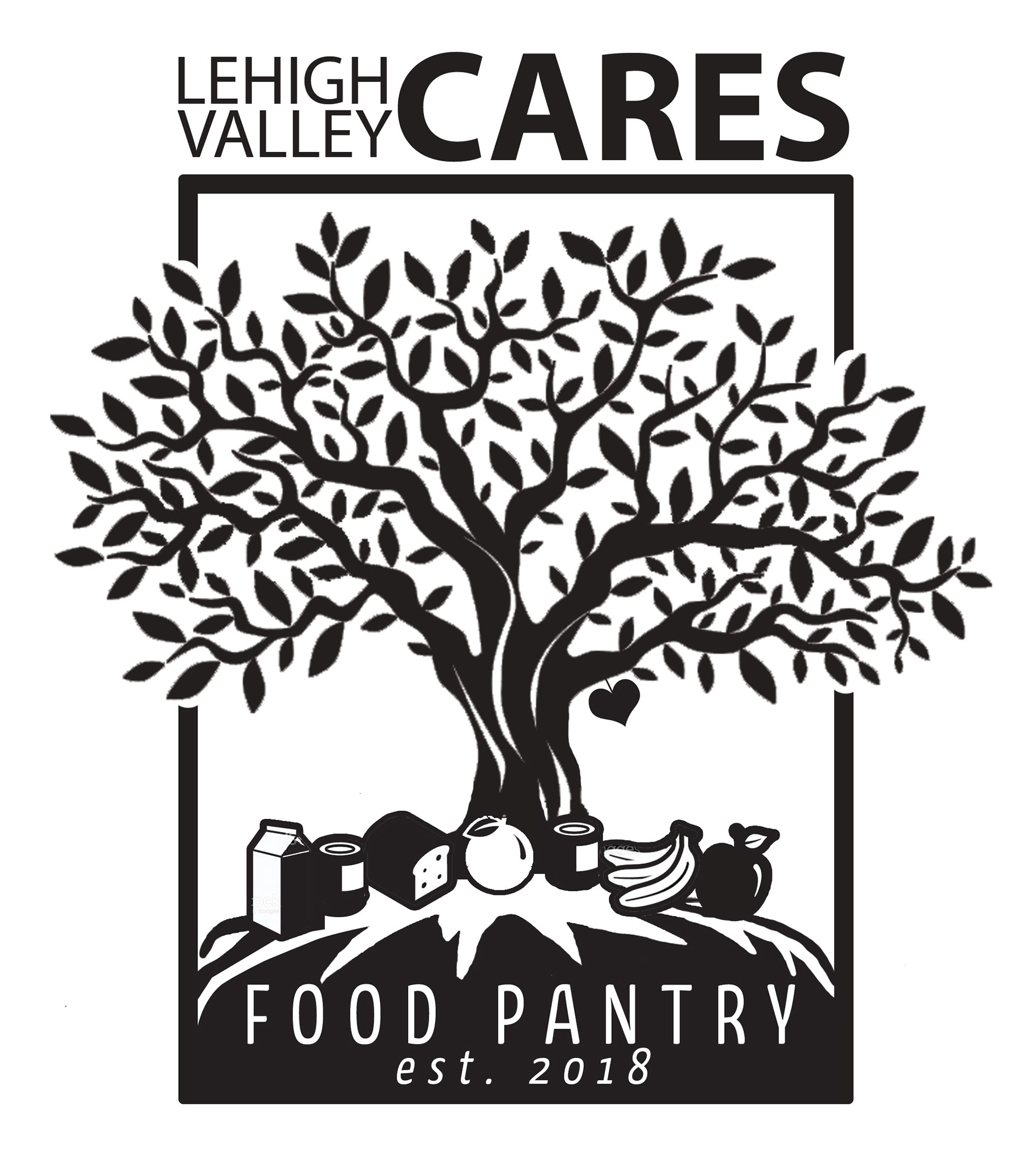
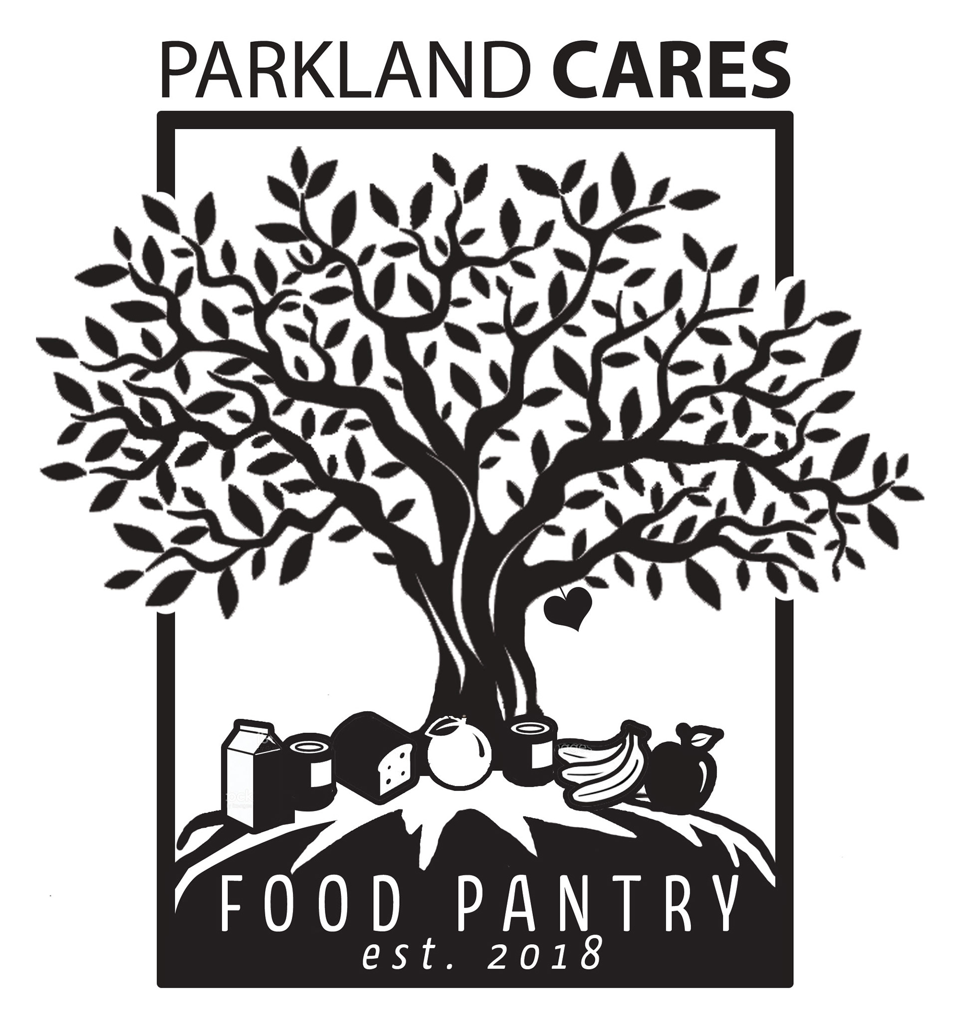
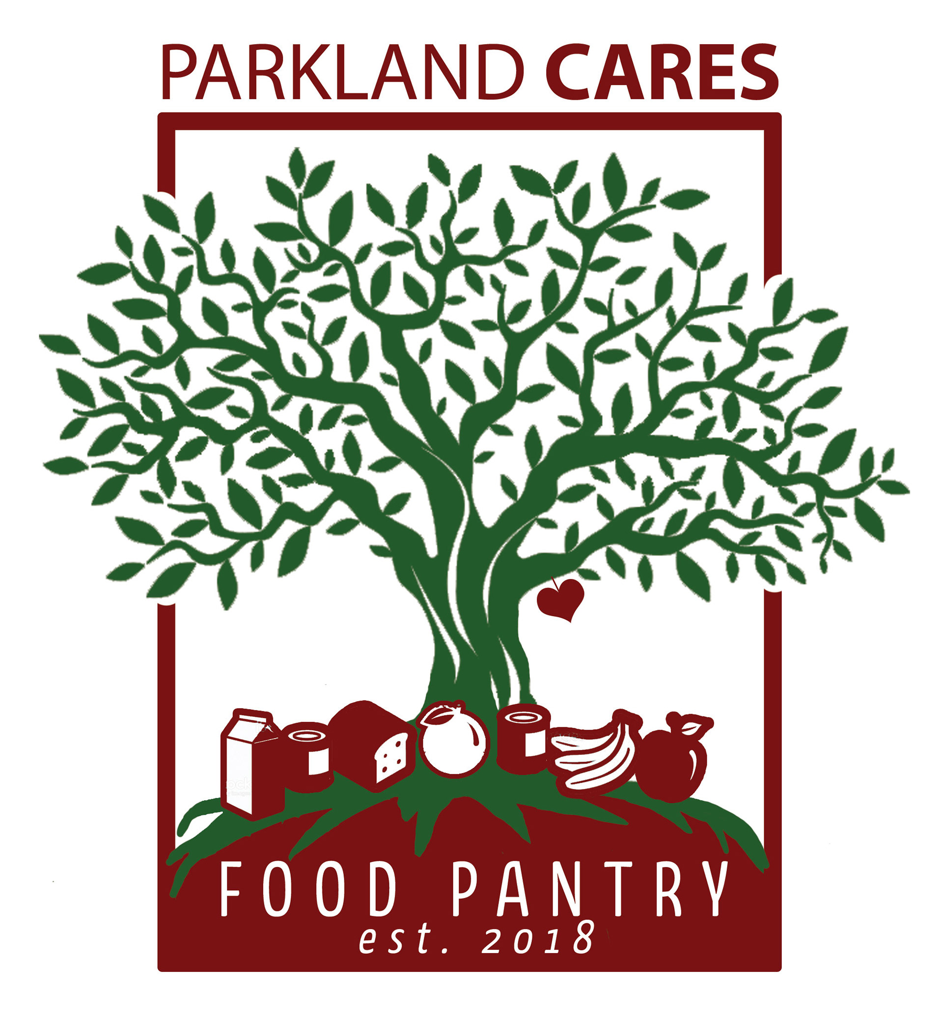
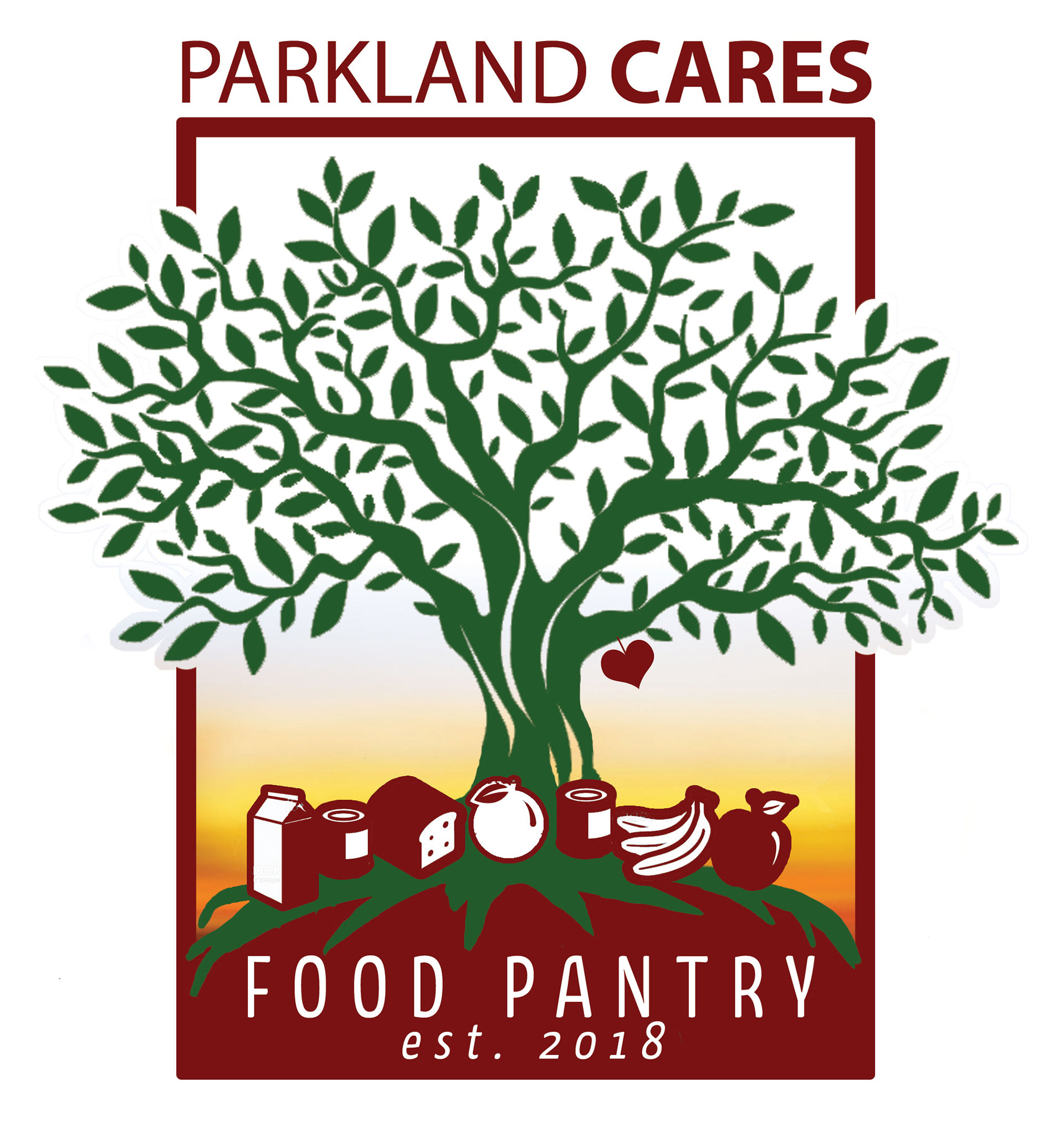
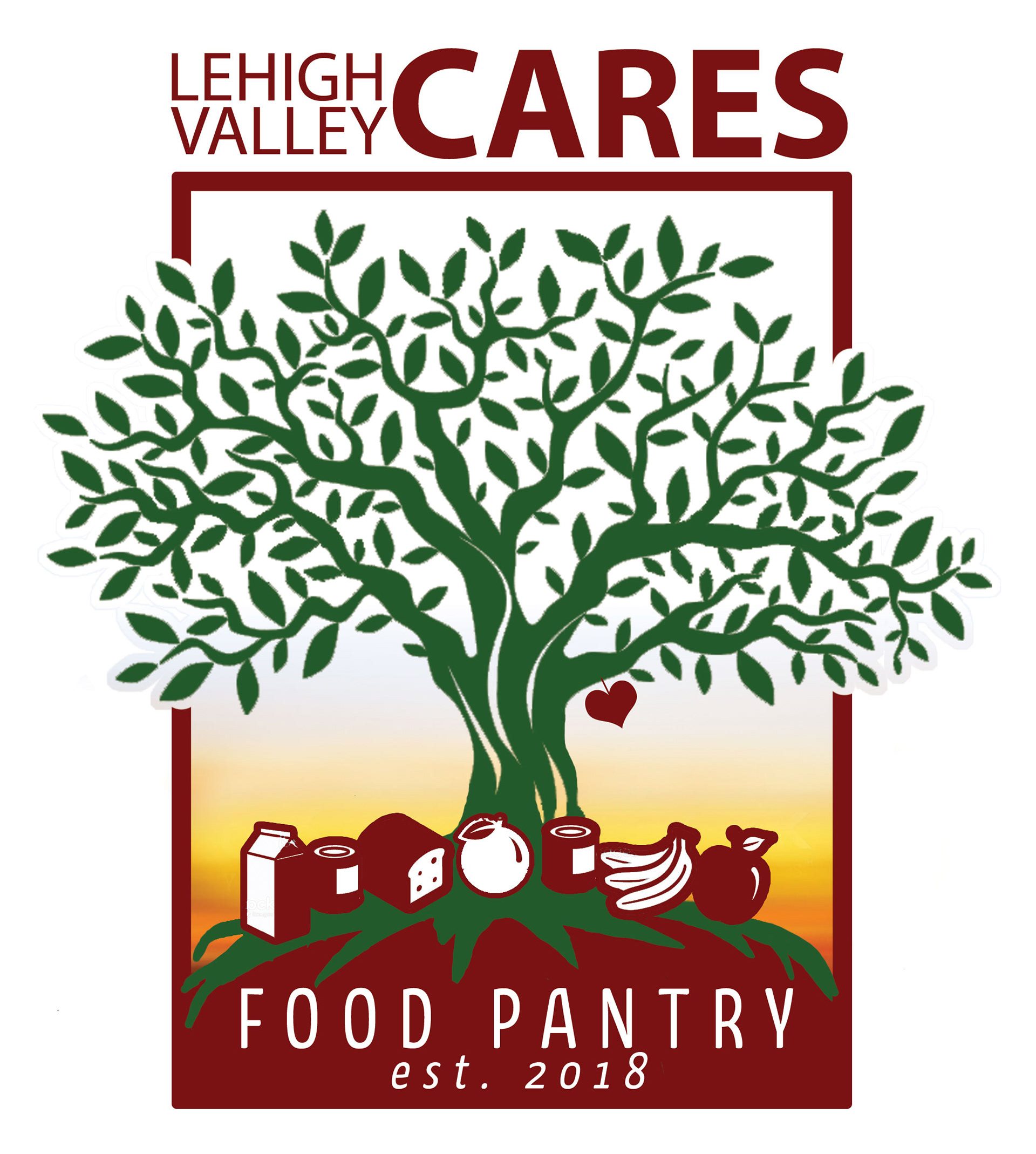
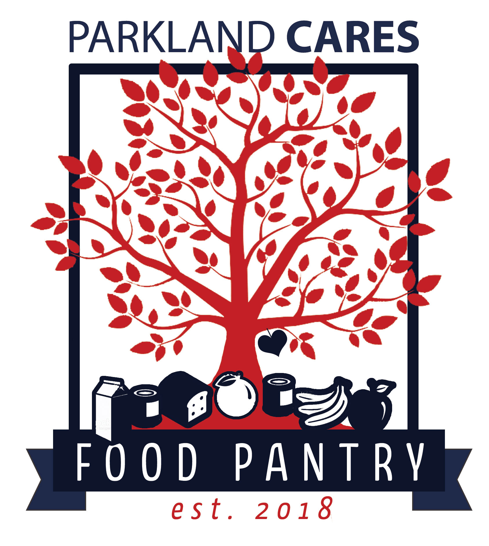
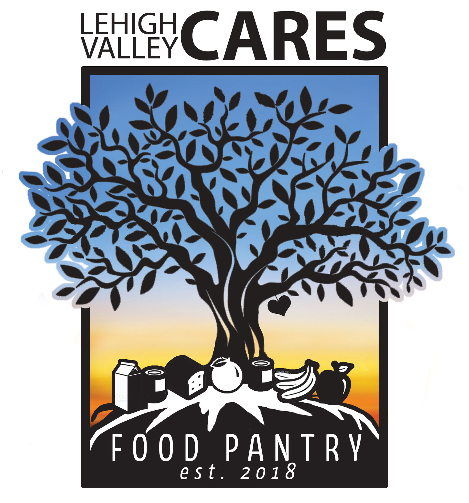
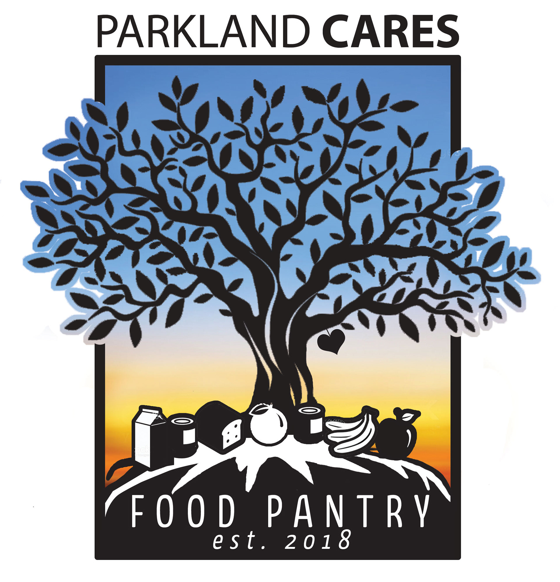
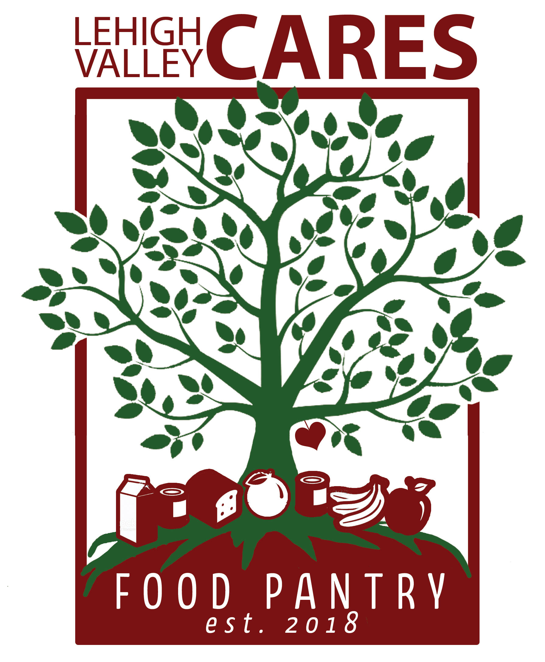
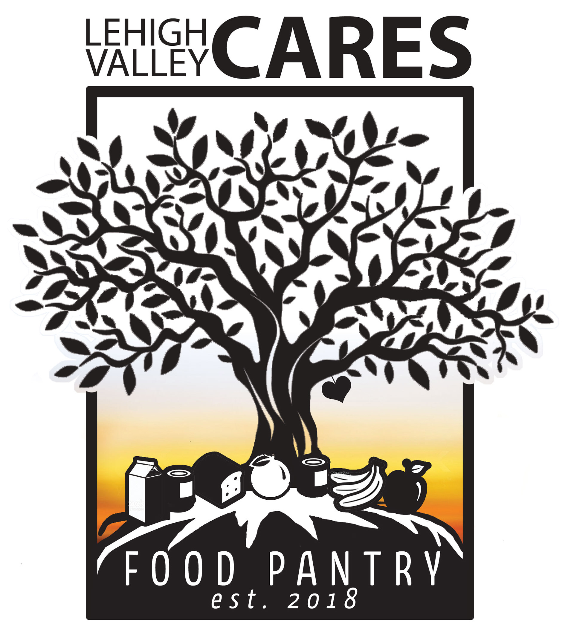
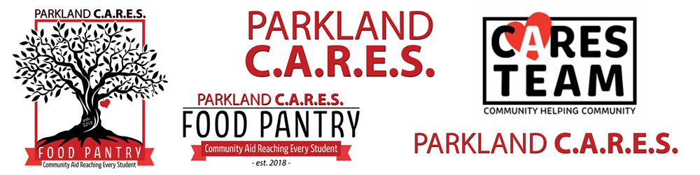
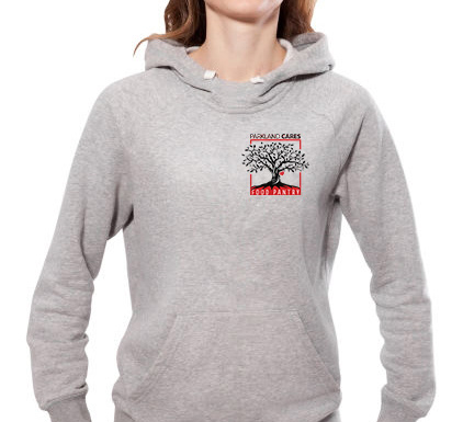
This was a logo created for Parkland C.A.R.E.S., which is a non-profit organization dedicated to supplying aid to families that live in lower income households. They strive to feed and serve every member of our community affected by and suffering from hunger. We wanted to create the logo as a tree with strong roots. The tree would represent the tie this organization would have with the community.
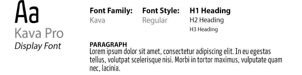
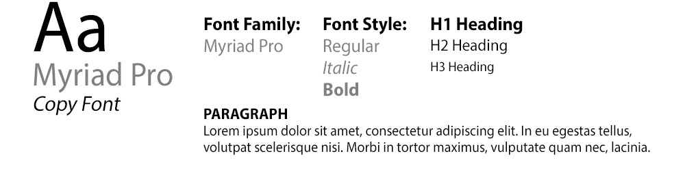
Typography
Color Palette

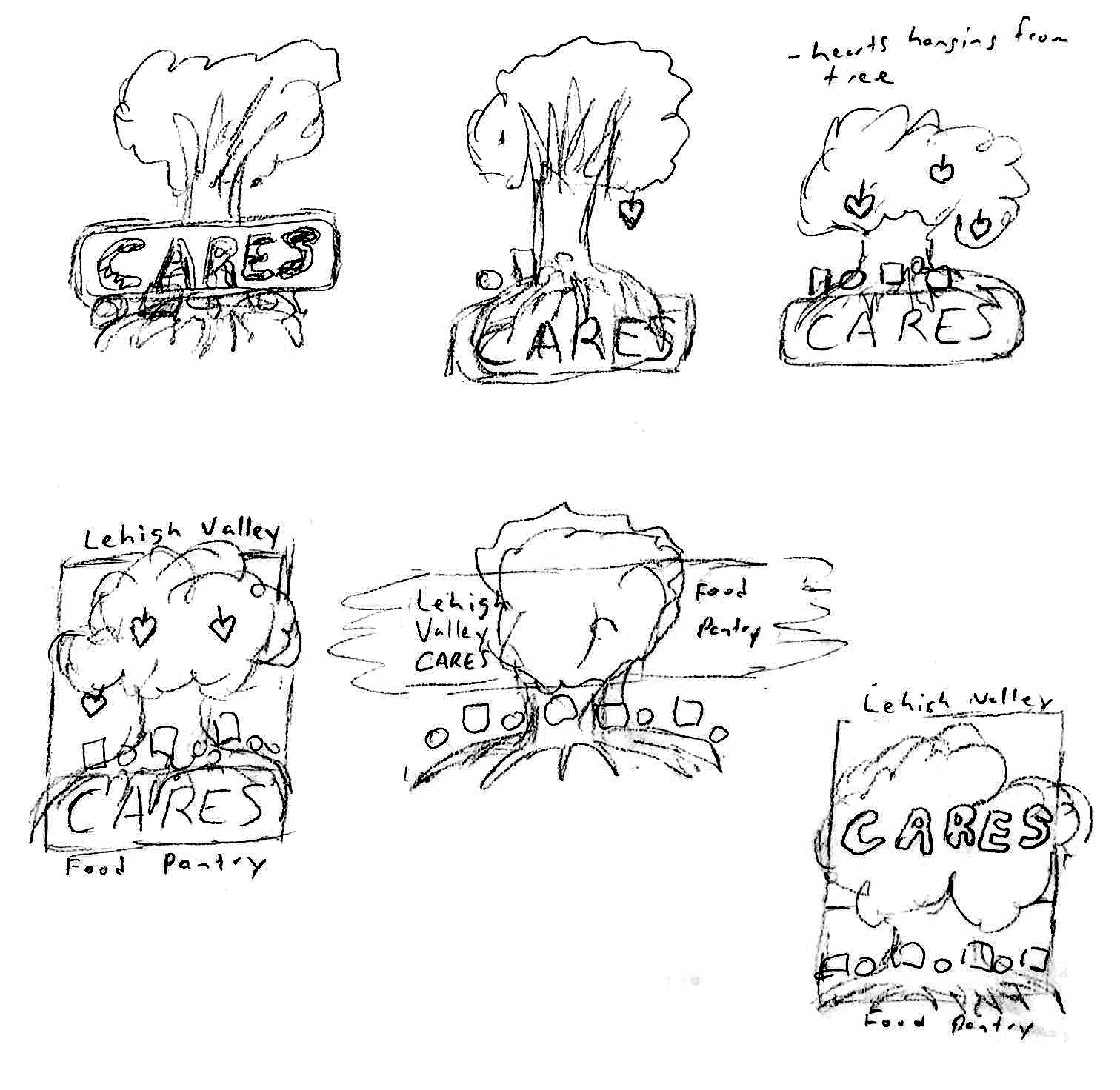
PROCESS
The design inspiration came about after a discussion with the Executive Director. She explained to me the story of why she wanted to start this organization. We spoke about a tree shape and what it could mean for its tie to a community. A single red heart shaped leaf is displayed on an under-hanging branch to represent the individual who inspired the start of pantry. The leaf was the true inspiration for the branding. The truly ironic thing about the concept of the logo was that we had not spoken a word about a leaf. I felt like the tree needed a representation of the love it would have on the community, so I added it. Later the Executive Director told me that the day she decided to begin this journey to start a pantry, one of her children saw a single red leaf in the shape of a heart fall from a tree. This leaf represented someone they had lost tragically. It's definition of love and dedication are seen everyday.
Mock ups
RESULT
After many comps, revisions and edits the final product was exactly what they were looking for. The Executive Director was also amazed with the use of the heart shaped leaf and had belief that it was meant to be there. Everything from the design and layout to the colors and fonts used, it hit the mark and would be a great symbol of relief for many families for many years to come.
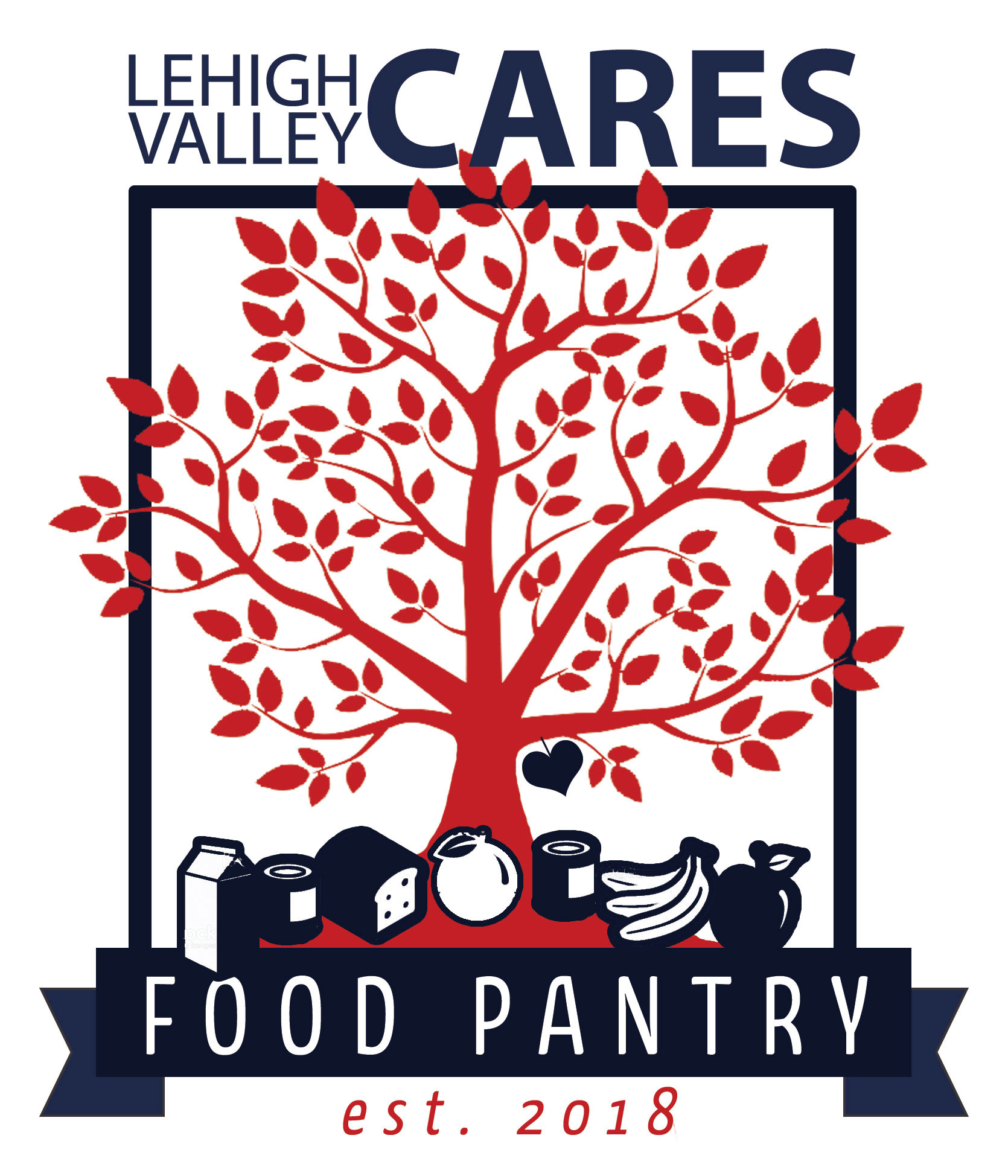
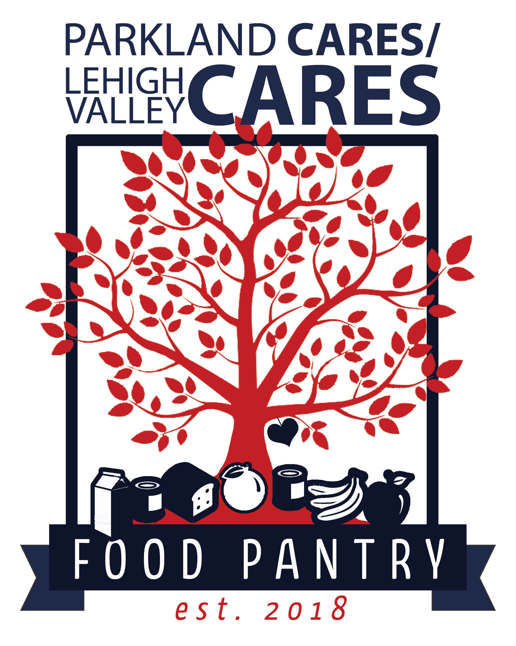
We are currently in the process of refining the logo now. After almost 3 years being open, the pantry has grown 178% capacity and now services over 140 families on a weekly basis. They are looking for a more streamlined design that would be a symbol for not just their community but communities around the area. I am very proud to have the chance to work on this project and can't wait to see how it grows. More to come...
Primary and Secondary Logos
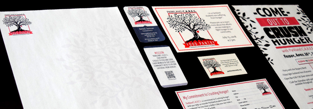
Stationery
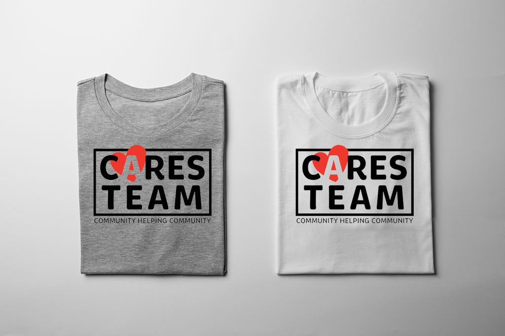
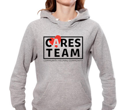
Apparel Display
CONCLUSION
The pantry has grown to be a symbol of hope for many families in our area. Its voice is heard in many channels of marketing but i think word of mouth draws the most attention. Facebook and Instagram i also feel give it a great presence as well and allow it to reach a broader audience.
Programs and Tools Used